CSS Cheatsheet
CSS (Cascading Style Sheets) is the language used to style web pages, controlling their layout, colors, fonts, and overall appearance.
Including CSS
CSS can be applied to HTML in three ways: Internal, External and Inline
<html>
	<head>
		<title> Some Title </title>
		<!-- Internal style: useful for single pages -->
		<style>
			h1{
			font-size: 20px;
			}
		</style>
		<!-- External style: Best for reusability -->
		<link rel="stylesheet" type="text/css" href="style.css">
	</head>
	<!-- Inline Styles: Not recommended for large projects due to maintenance issues -->
	<body style="color: white; background: red;">
		<h1> A Main Heading </h1>
		<p> This is a paragraph </p>
		<img src="" alt="" />
		<a href="some link " target="_blank"> This is a link </a>
	</body>
</html>
Selectors
Selectors target HTML elements to apply styles.
/* Element Selector: Targets all instances of a tag */
h1 {
    color: navy;
}

/* Class Selector: Targets elements with a specific class */
.button {
    background-color: #ff4500;
    padding: 10px 20px;
}

/* ID Selector: Targets a unique element */
#navbar {
    width: 100%;
    background-color: #333;
}

/* Grouping Selector: Applies styles to multiple selectors */
h1, p, .container {
    font-family: Arial, sans-serif;
}

/* Descendant Selector: Targets elements inside another */
div.headings h1 {
    font-size: 18px;
}

/* Child Selector: Targets direct children of an element (not descendants) */
div > h1 {
    color: teal;
}

/* Adjacent Sibling Selector: Targets an element that is immediately preceded by another element. */
h1 + p {
    font-size: 14px;
}

/* General Sibling Selector: Targets all siblings of an element. */
h1 ~ p {
    color: gray;
}

/* Pseudo-Class Selectors: Target elements in specific states */
a:link { color: blue; } /* Unvisited links */
a:visited { color: purple; } /* Visited links */
a:hover { color: red; } /* Mouse over links */
a:active { color: green; } /* Clicked links */
li:first-child { font-weight: bold; } /* First <li> in a list */
li:nth-child(2) { color: gray; } /* Second <li> */

/* Pseudo-Element Selectors: Style specific parts of an element */
p::first-letter {
    font-size: 1.5em;
    color: red;
}
p::before {
    content: "★ ";
}

/* Attribute Selector: Targets elements with specific attributes */
input[type="text"] {
    border: 1px solid #ccc;
}
Units
CSS units define sizes and distances. They can be absolute (fixed) or relative (scaled to context).
- Pixels (px) : Fixed units, but avoid for font sizes as they ignore browser accessibility settings (e.g., text resizing).
- em : Relative to the parent element’s font size. 1em = parent’s font size (default: 16px).
- rem : Relative to the root element’s font size.
- Percentage (%) : Relative to the parent’s dimensions.
- vw/vh : Relative to viewport width/height (e.g., 10vw = 10% of viewport width).
- vmin/vmax : Relative to the smaller/larger of viewport width or height.
html {
    font-size: 16px;
}
.parent {
    font-size: 1.5em; /* 1.5 * 16px = 24px */
}
.child {
    font-size: 1.5em; /* 1.5 * 24px = 36px */
}
.root-based {
    font-size: 1.5rem; /* 1.5 * 16px = 24px */
}
.container {
    width: 80%; /* 80% of parent width */
    height: 50vh; /* 50% of viewport height */
}
Colors
CSS supports multiple color formats
- RGB: rgb(255, 120, 0) (red, green, blue values from 0-255).
- RGBA: rgba(255, 120, 0, 0.5) (adds alpha for opacity, 0 to 1).
- HEX: #FF7800 (6-digit code for red, green, blue).
- Named Colors: red, blue, etc.
- HSL: hsl(30, 100%, 50%) (hue, saturation, lightness).
Resources - material-ui , colorhunt
Typography
Typography controls text appearance
- Serif Fonts: Times New Roman, Georgia (formal, used for headings).
- Sans-Serif Fonts: Arial, Helvetica, Verdana (clean, modern).
- Monospace Fonts: Courier New, Consolas (fixed-width, ideal for code).
Font Family Rules:
- Use quotes for font names with spaces: “Courier New”.
- Generic families (e.g., sans-serif, monospace) don’t need quotes.
- Always provide fallback fonts.
body {
    font-family: "Roboto", Arial, sans-serif;
    font-size: 16px;
    line-height: 1.5;
}
code {
    font-family: Consolas, monospace;
}
Resource - Google Fonts
Box Model
The box model defines how elements are sized and spaced.
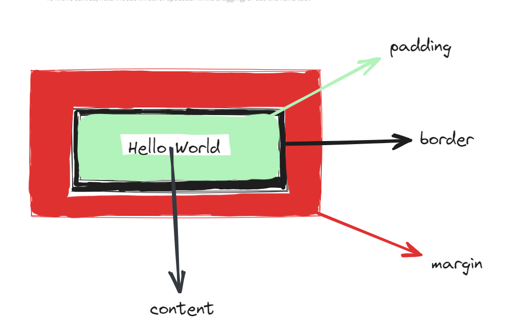
.box {
    width: 200px;
    padding: 20px;
    border: 5px solid black;
    margin: 10px;
    box-sizing: border-box; /* Ensures padding/border don’t increase total size */
}
Background Images
div {
    background-image: url("https://example.com/image.jpg");
    background-repeat: no-repeat;
    background-size: cover; /* Scales image to cover element */
    background-position: center; /* Centers image */
    background-attachment: fixed; /* Image stays fixed on scroll */
    /* Shorthand */
    background: url("image.jpg") center/cover no-repeat fixed;
}
Images
img {
  max-width: 100%;
  height: auto;
  display: block;
}

/* Image inside cards */
.card img {
  width: 100%;
  height: 200px;
  object-fit: cover; /* avoids stretching */
  border-radius: 8px 8px 0 0;
}
Gradients
div {
    background-image: linear-gradient(to right, blue, green); /* Left to right */
    background-image: radial-gradient(circle, red, yellow); /* Circular gradient */
}
Positioning
Positioning controls element placement:
- Static: Default, follows document flow.
- Relative: Moves relative to its original position.
- Absolute: Moves relative to the nearest positioned ancestor.
- Fixed: Stays fixed relative to the viewport.
- Sticky: Sticks to the viewport when scrolling past.
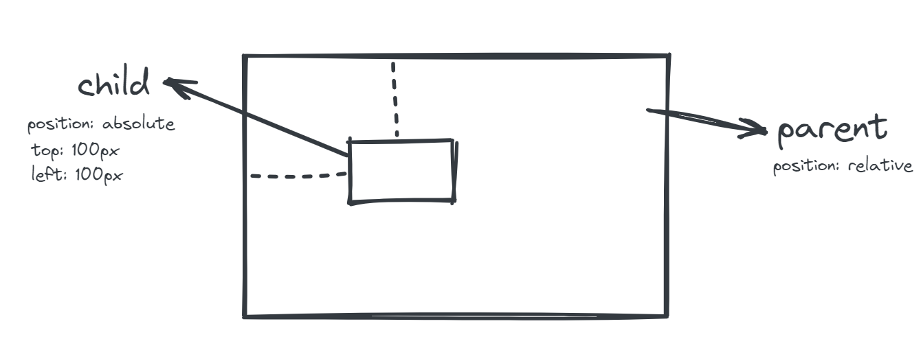
Example -
position: relative sets a context, while absolute to child div lets it move within parent.
position: relative can also be used to position parent element as well(based on previous location within document flow)
CSS Variables
CSS variables store reusable values.
:root {
    --primary-color: #007bff;
    --max-width: 1000px;
}
@media screen and (max-width: 768px) {
    --max-width: 800px;
}

.container {
    color: var(--primary-color);
    max-width: var(--max-width);
}
Flexbox
It is used to create flexible, one-dimensional layouts.
/* Basic flex container */
<div class="container">
	<div class="item1">1</div>
	<div class="item2">2</div>
	<div class="item3">3</div>
</div>

/* Styles */
.item1{
  background-color: red;
  padding: 20px;
}
.item2{
  background-color: green;
  padding: 20px;
}
.item3{
  background-color: yellow;
  padding: 20px;
}

.container {
	display: flex;
	flex-direction: column; /* vertical stacking */
	justify-content: center; /* horizontal align. Other values - flex-start, space-between .. */
	align-items: center; /* Vertical align. Other values - flex-end, baseline */
	flex-wrap: wrap;
}

/* Flex items */
.item1 {
  background: red;
  padding: 20px;
  align-self: stretch; /* overrides parent alignment */
  flex-grow: 1;
}
.item2 {
  background: green;
  padding: 20px;
  flex-grow: 3;
}
.item3 {
  background: yellow;
  padding: 20px;
}


/* flex shorthand */
flex: [flex-grow] [flex-shrink] [flex-basis]
Resource - CSS-Tricks Flexbox Guide
Grid
It creates two-dimensional layouts.
.container {
  display: grid;
  grid-template-columns: 1fr 2fr 1fr; /* 3 columns: flexible fractions */
  grid-template-rows: auto 200px;     /* 2 rows: auto height + fixed 200px */
  gap: 10px;                          /* spacing between rows/columns */
  justify-items: center;              /* horizontal alignment of items */
  align-items: stretch;               /* vertical alignment of items */
}

.item1 {
  grid-column: 1 / 3; /* spans from column 1 to 2 */
  grid-row: 1;        /* sits in row 1 */
}

.item2 {
  grid-column: 3;     /* sits in column 3 */
  grid-row: 1 / 3;    /* spans rows 1 and 2 */
}

.item3 {
  justify-self: end;  /* overrides container’s justify-items */
  align-self: center; /* overrides container’s align-items */
}
Resource - CSS-Tricks Grid Guide
Responsive Layouts
- Auto-Responsive Grid
.grid {
  display: grid;
  grid-template-columns: repeat(auto-fit, minmax(250px, 1fr));
  gap: 16px;
}
- Flex Alternative
.flex {
  display: flex;
  flex-wrap: wrap;
  gap: 16px;
}

.flex > * {
  flex: 1 1 250px;
}
- Media Queries
@media (max-width: 768px) {
  .navbar {
    flex-direction: column;
  }
}
Forms
input, textarea, select {
  width: 100%;
  padding: 10px;
  border: 1px solid #ccc;
  border-radius: 6px;
  font-size: 14px;
}

input:focus, textarea:focus {
  border-color: #007bff;
  outline: none;
}

/* Button */
button {
  background: #007bff;
  color: white;
  padding: 10px 16px;
  border: none;
  border-radius: 6px;
  cursor: pointer;
}

button:hover {
  background: #0056b3;
}
Utility Patterns
/* Container pattern */
.container {
  max-width: 1200px;
  margin: 0 auto;
  padding: 0 16px;
}

/* Section spacing */
.section {
  padding: 60px 0;
}

/* Button spacing */
.btn {
  padding: 10px 16px;
  border-radius: 6px;
  border: none;
  cursor: pointer;
}
.btn-primary {
  background: #007bff;
  color: white;
}

/* Hover and Interaction */
.card {
  transition: transform 0.2s ease, box-shadow 0.2s ease;
}
.card:hover {
  transform: translateY(-5px);
  box-shadow: 0 10px 30px rgba(0,0,0,0.15);
}